Enticing and informing viewers
iflix is a fast-growing TV and movie streaming service focused on South East Asia and developing markets. As part of the hiring process, I was asked to redesign their Android app's title screen.
The brief
Design 'The Magicians' (TV show) details page for the Android Mobile App.
This is the screen a user gets to when they've pressed on 'The Magicians' poster on the homepage to see more details and eventually watch the show.
You'll need to research and gather the show details yourself, but I have attached The Magician's image and logo for you to use.
Please include some of your design process in your email - wireframes, research, inspiration etc. so I can get an idea of how you landed at your final design.
The plan
I was told about the trial design task on a Friday morning and I agreed to a due date of the following Tuesday morning. Luckily I had a quiet weekend planned!
I decided on a personal limit of 9 hours on this task. I estimated I could spend 3 hours on research and UX design, 3 hours on visual design, and then I would need 3 hours to polish, export and present my work. This ended up being almost exactly right.
Research
Getting to know iflix
My first task was to find as much information as I could about iflix and their apps.
Since iflix isn't available in Australia, I browsed the iflix website, used Google Image Search, and hunted down screenshots on the Google Play Store and Apple App Store.
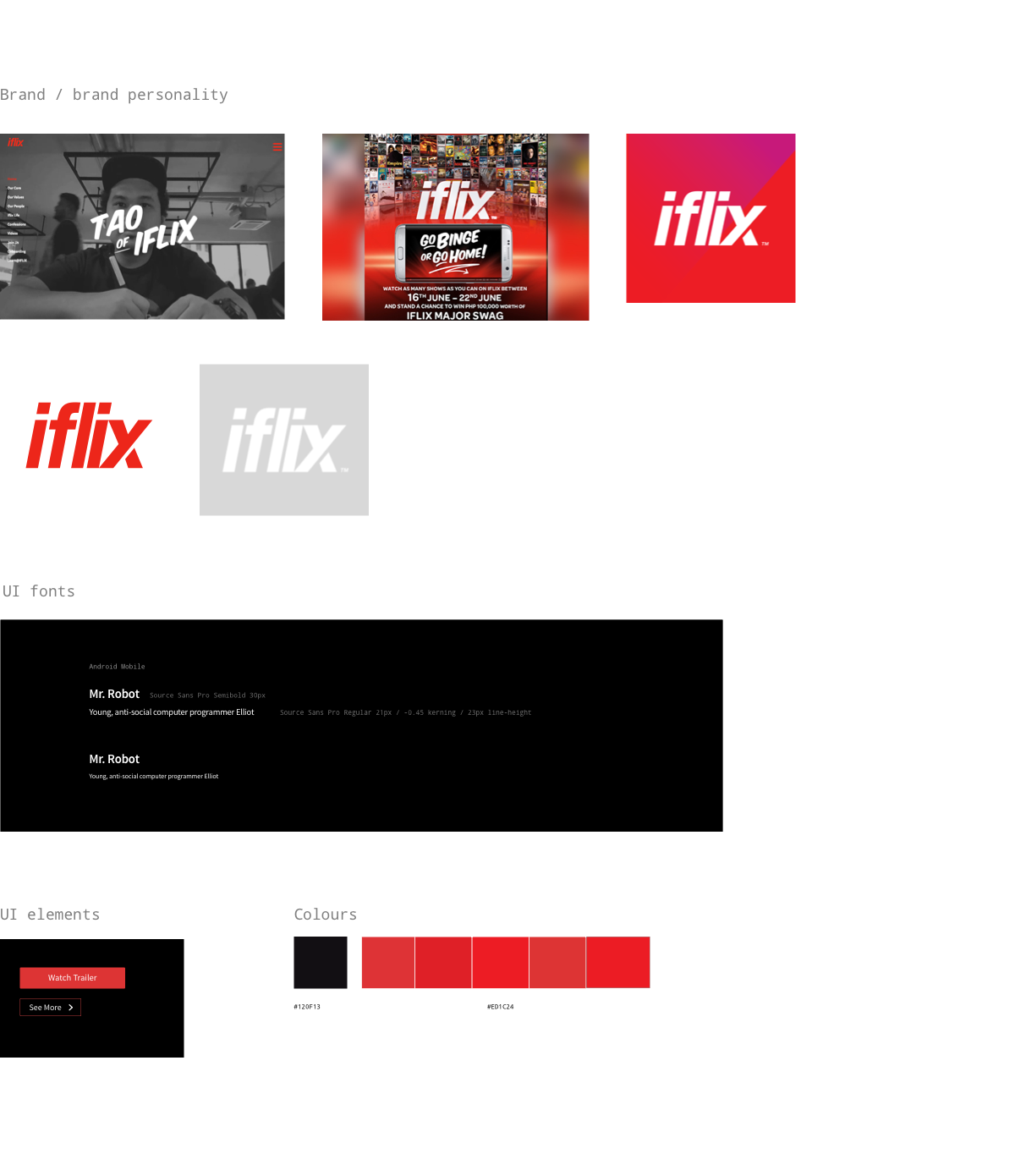
I looked closely at what I could see of the user flow and functionality, and I absorbed the current visual style, terminology, and the brand personality.
Notably, iflix has a very distinctive brand voice and personality – it's a very loud, young, confident company that takes risks and breaks rules.
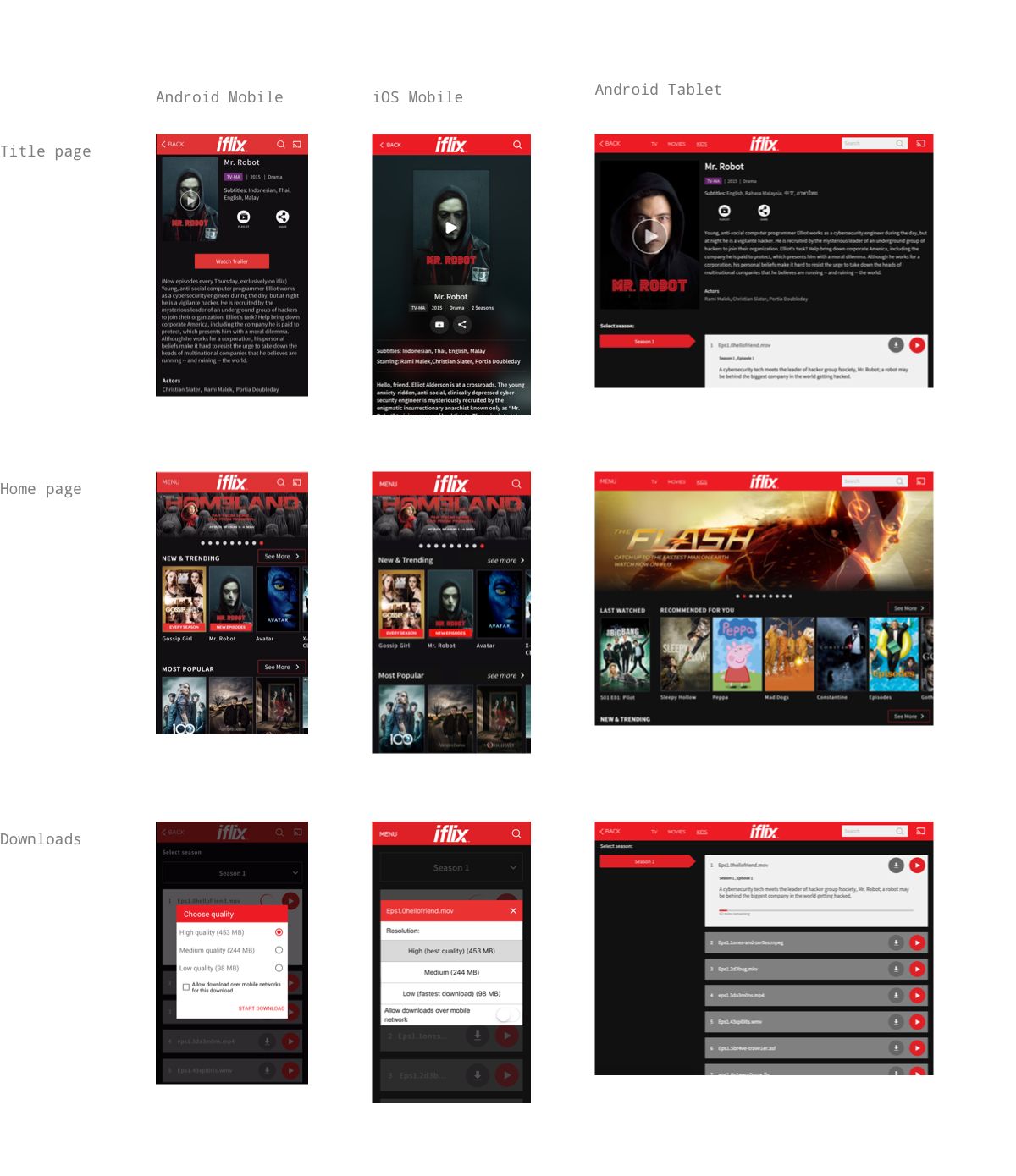
Review of iflix apps (March 2017)
Review of other iflix brand elements
Checking out the competition
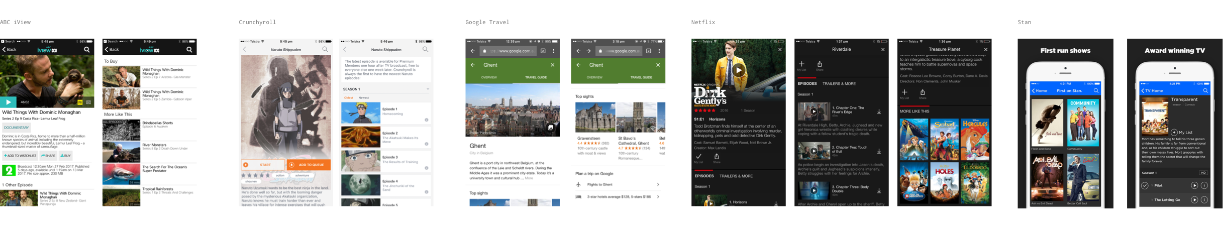
Next, I wanted to see how other services solved similar problems. I looked at the episode and title screens for other streaming services, through screenshots or by downloading and using apps when possible.
I paid attention to the information shown to users and its heirarchy and layout, and the functionality provided on each screen and how it was presented.
As the design brief was for Android Mobile, I knew I'd need to reference the Material Design guidelines. I looked at the YouTube app and also the Google Travel Guide as this seemed like a similar use case - giving the user a quick feel for something through images and text-based information.
Review of other apps
Zooming in on the current page
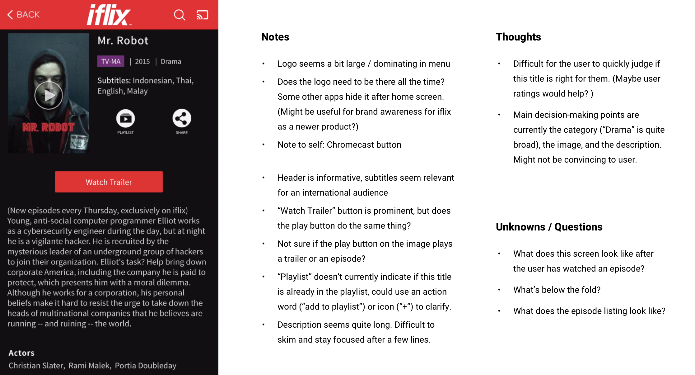
Finally, I had a closer look at the current iflix title page and wrote some notes.
By this point I had already formed some ideas about what the user would want to do on this page. This is reflected in my notes on the design at the time (below right) but I'll also detail those further in the next section.
Current title page (March 2017)
Defining the problem
After absorbing this research, I came up with the following assumptions, business goals and user needs that I would be trying to address in my designs.
Assumptions
- iflix want to use the new landscape image and title logo provided
- iflix are looking for a new concepts for a title page design that might present new opportunities and more value to users (i.e. not 'just' adding the new images)
- The design should adhere to the Google Material Design guidelines where appropriate
Business goals
- Discovery: Help users find content they enjoy so they continue using the service
- Usability: Let users easily watch content once they've found it
- Quality/Prestige: Present content in an appealing way
User needs
- Users want to find out more about a title:
- What is it about?
- Will I like it?
- Is it in my language?
- Do other people like it?
- Is it a genre that I like?
- Is it similar to other things I like?
- How long is it? (movie or episode duration, number of episodes and seasons)
- Users can watch the title
- Users can cast the title via Chromecast
- Users can watch a trailer
- Users can save it to a playlist
- Users can download to watch later
- Users can share
Discovering opportunities
Three "value add" opportunities for the design were in my mind at this point. They were:
Acknowledge the truly international audience
iflix's markets are not only multi-national – they are multi-cultural and multi-lingual.
For instance, in Malaysia there's a large population of Chinese and Indian people as well as the native Malay, not to mention many native and aspirational English speakers.
I hadn't seen other competitors make a point of adapting to local markets so I thought this could be a differentiator for iflix.
I decided that a basic way to address this would be for users to be able to specify their preferred language and for the design to highlight when a title is available in that language.
User-specific recommendations
The primary user need is to decide whether they will like the title. The current design had little to help users make this decision.
I thought that peer recommendations - user ratings - could help, though I acknowledged it would have a hefty development overhead.
iflix already had a system for "similar" titles and also celebrity playlists that users could choose to follow. I thought these existing features could be leveraged to give the user more information about the title and help the user in their decision-making.
Title-specific adaptations
With a large amount of content for the user to browse through, how can each title be made just that little bit more memorable and unique?
My idea was that the dominant and contrasting colours from the title images or logos could be automatically generated and used in the design.
Sketching & Preparation
I did some quick sketches to explore possible layouts. Sadly I didn't capture all of them to show in this case study – they were quick and messy – but after a few iterations I came up with this more detailed sketch (below, left).
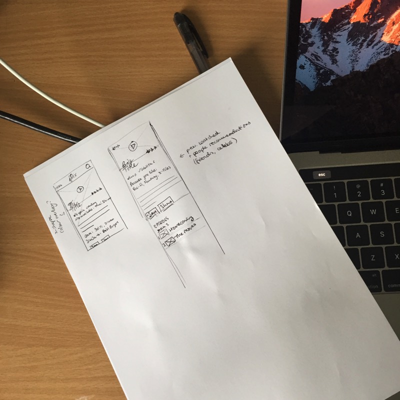
I read through the Material Design guidelines and set up standard grids and proportions in Sketch (above, right). Although I'd referenced the guidelines before, this was the first time I was making something to align closely.
I also set up the current title page next to my artboards as a reference to ensure I wouldn't miss any existing features or functionality.
This was about all I could manage in the three hours I'd allowed myself for research, UX, and planning, so it was time to move on to the next stage!
Visual Design
I spent a few hours turning my sketches into polished concepts in Sketch that adhered to the Material Design guidelines.
I addressed the three opportunities that I'd identified in the discovery phase:
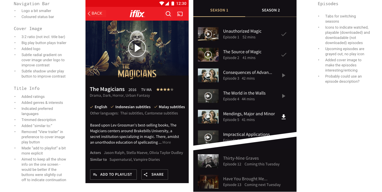
Acknowledging the international audience
The user's preferred languages are displayed first and highlighted.
User-specific recommendations
I added ratings, similar titles, fine-grained genres, and celebrity playlists.
Title-specific adaptations
I used the primary colour from the logo as a theme colour for elements.
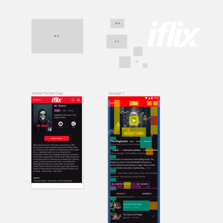
Below are my three final design concepts that were presented, along with how I described each of them at the time.
Concept 1
This concept implements the new cover image and logo, incorporates some thoughts from the review of the current design and the key ideas (see notes). The logo image’s dominant colour has been used as the feature colour.
Concept 2
In this concept I wanted to try removing the red toolbar for a more “full screen” experience. I also realised that the title text was repeated, so I removed it and centre-aligned the “metadata” below the logo.
I wanted to add another use of the feature colour, so I added a diagonal swash that was the same angle as the “x” in the iflix logo (I thought it would be cool to use that as a device somehow). It also increased the contrast of the “back” button over the cover image.
I also mocked up another screen to see how the feature colour concept worked with another title. The movie example shows a few different bits of information and a “playlist” feature.
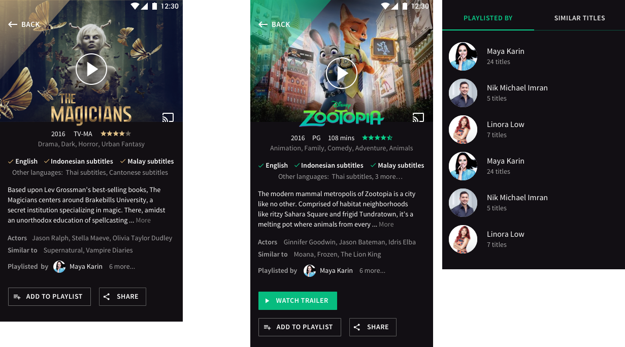
Concept 3
Finally, I thought it could be fun to include more of the iflix brand personality in the app. I thought the recommendations sections could be made a bit more “iflixy” through use of a brush font (like in iflix’s marketing material), a more casual tone of voice, and more illustrated / fun icons.
I was going to use a thumbs up icon, but apparently that’s seen as rude in some countries. Seemingly the peace sign is a little bit more generally acceptable!
I was a bit more loose with this concept. I’d do a pass to tighten it up onto the 8px grid, but it felt good to space the elements out a bit more.

Design notes
I presented the following notes along with my concepts:
I was wary of emulating the Netflix app too much in these designs, but it does have a solid layout. Moving to a horizontal cover image utilises that space well as the proportions hint to the user that it’s a video and playable.
I think iflix could differentiate itself through the social aspects - playlists - and the brand personality. Netflix is pretty neutral while iflix has a strong voice.
With this task in particular, I think this cover image might not be the strongest choice for this show. I haven’t seen the show, but having read the book it was based on and read some research by Netflix on which types of images are successful, it seems that showing the human cast who are the main characters would hook in viewers.
Outcomes & Reflection
The concept designs were well received by the design team lead, who called me with a job offer the next day!
Looking at the designs a few months later, I'm pleased with how they turned out given the timeframe. More importantly, the insights I had at such an early stage were validated.
The minor usability and visual issues with the iflix Android app that I'd identified – the navigation bar, the button inconsistencies, and the overly-long description for titles – had all been addressed by the time I started at iflix.
The apps were in the midst of a major design overhaul when I joined, but my theory that languages were a key decision point for iflix's users was reflected in the new title page design. Languages are now listed first in the title's information.
The problems of user discovery and user engagement, it turns out, had also been recently identified and emphasised by management as goals and key metrics, and there is a focus on developing user recommendations in the future.
All in all, I very much enjoyed my time thinking about iflix's users, product and apps. They have an amazing service and company culture along with some fascinating design and technology challenges.