Powering up customer curation with lists
Company: Redbubble
Research, Strategy, UX & UI Design
Please excuse the shortness, this case study is work in progress. I'll briefly run you through the context and outcomes, and then share some collateral. If this is interesting, do get in touch!
Customer favourites were a core shopping feature on Redbubble that had languished on the legacy platform. With a goal of customer engagement and retention, we saw an opportunity to level up favourites into curated lists.
I was the product designer embedded in a cross-functional team with a product manager and 4–5 engineers, and with research support on hand.
This project involved lean research, team ideation, design exploration, prototyping and user testing, along with a quick-pivot experiment.
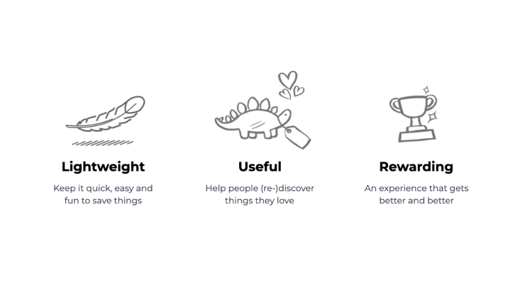
Through these activities we developed a shared understanding of what success would look like for customers, and I honed three core design principles for the experience.
Collaboratively, with prototypes and user feedback, I iterated towards a lightweight and fun interaction pattern underpinned by a powerful list concept.
Outcome
The new customer lists were well adopted and led to increased customer signups (+15%), conversion (+2%), and retention (+5% YoY).
Research
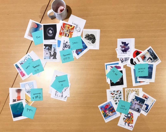
Internal lightweight favourites research
Understanding how people collected, used, and grouped their favourites.
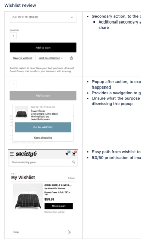
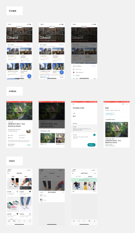
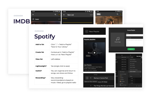
Landscape review
Reviewing lists and content-organising on different products and services.
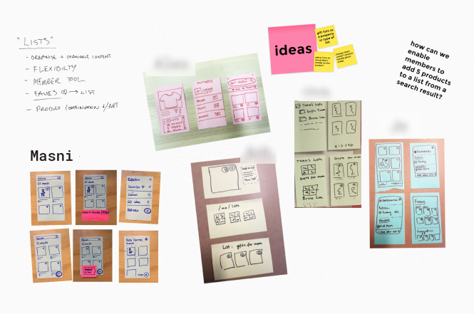
Team ideation
Exploration of adding to lists in a team sketch session
"Product demo" slides created by team members
Strategy & Design Principles
Key design principles
I defined and honed these principles based on research and our team discussions.
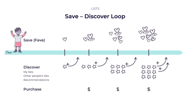
Rewarding customers
I recommended an engaging reward loop and value-add for our customers.
Interaction Patterns & Visual Concepts
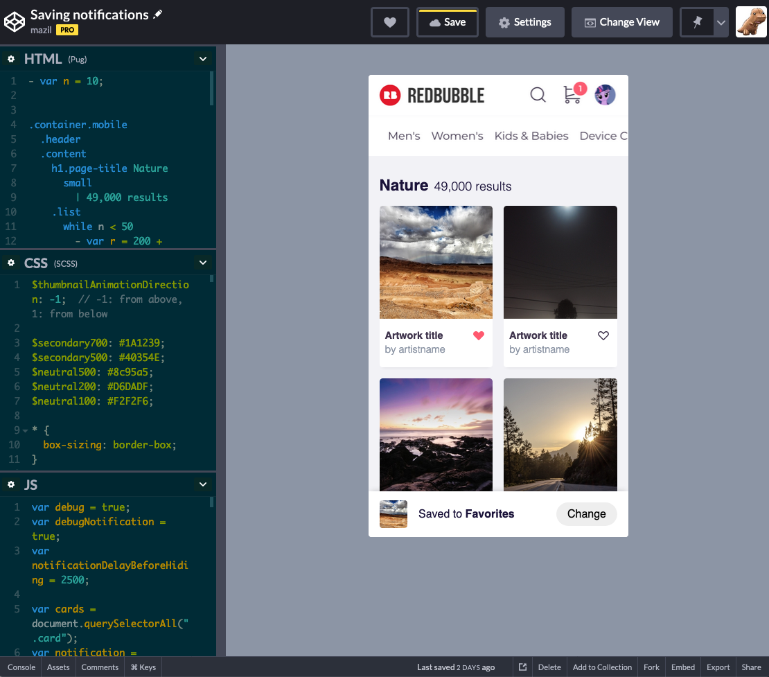
CodePen demo of an add-to-list interaction pattern to test speed and responsiveness.
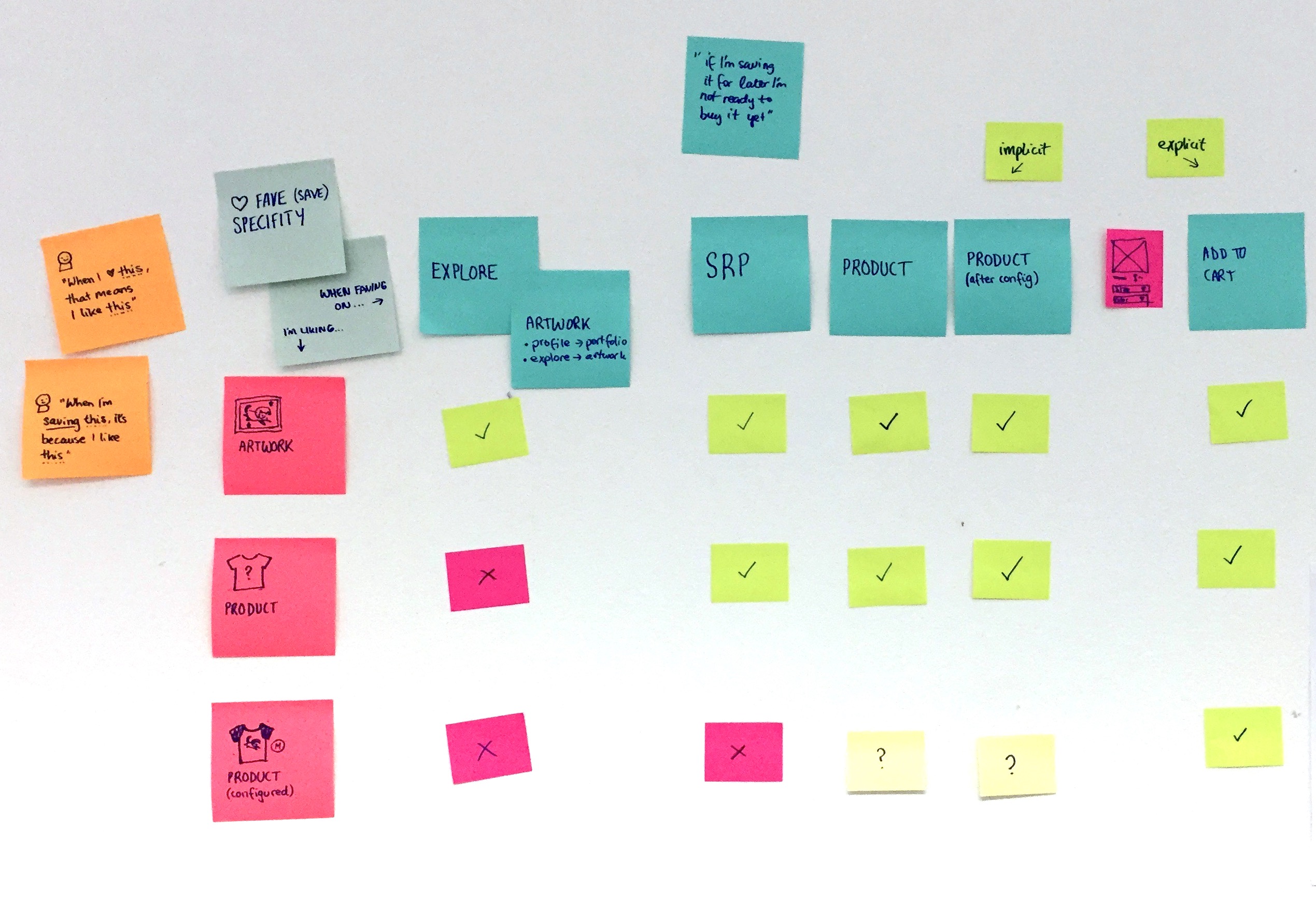
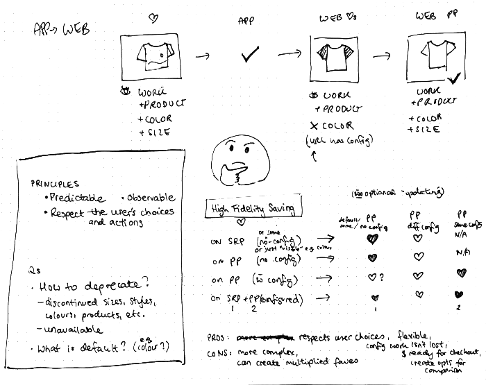
Exploring the underlying lists data model and architecture, and the implications for customers
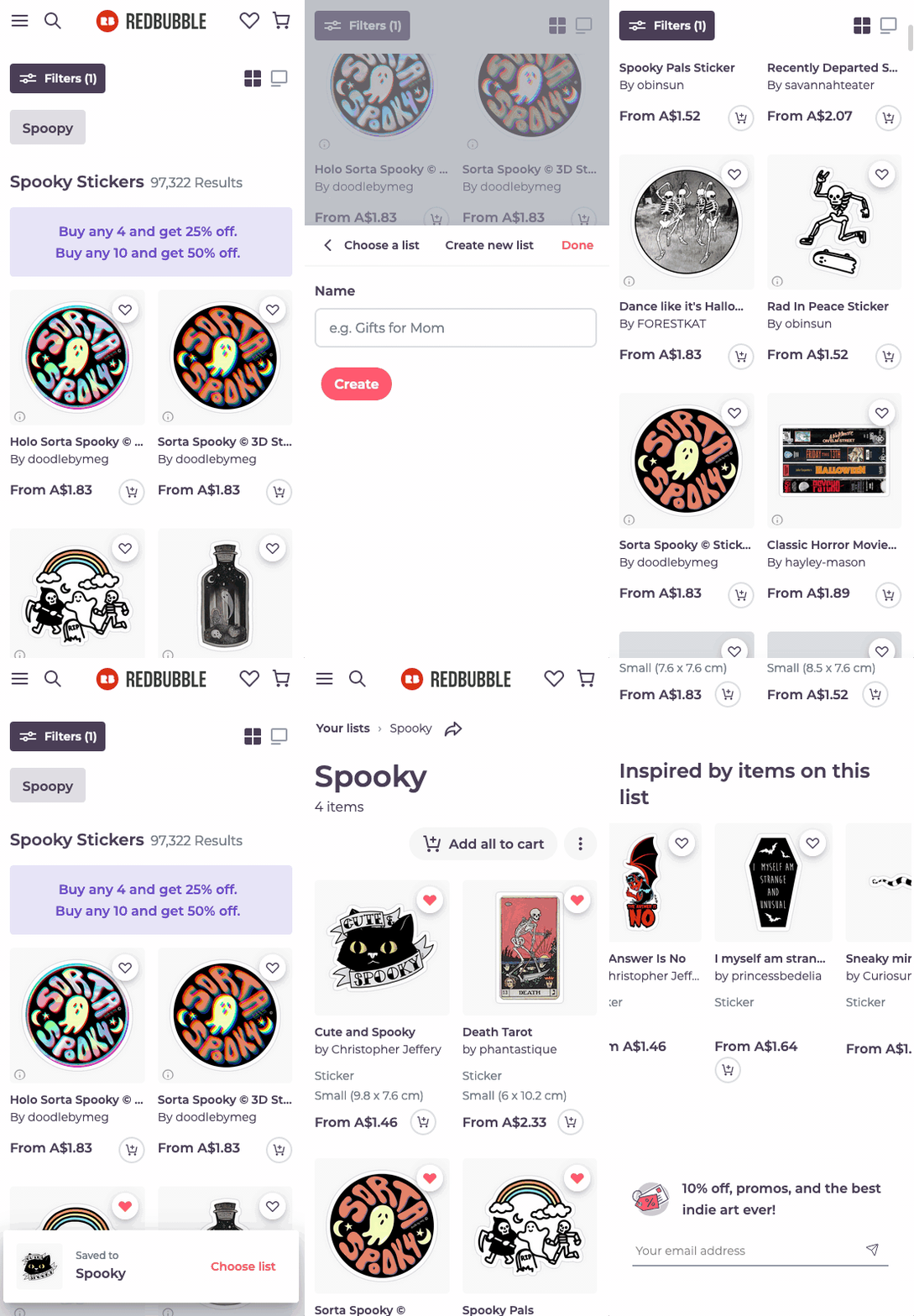
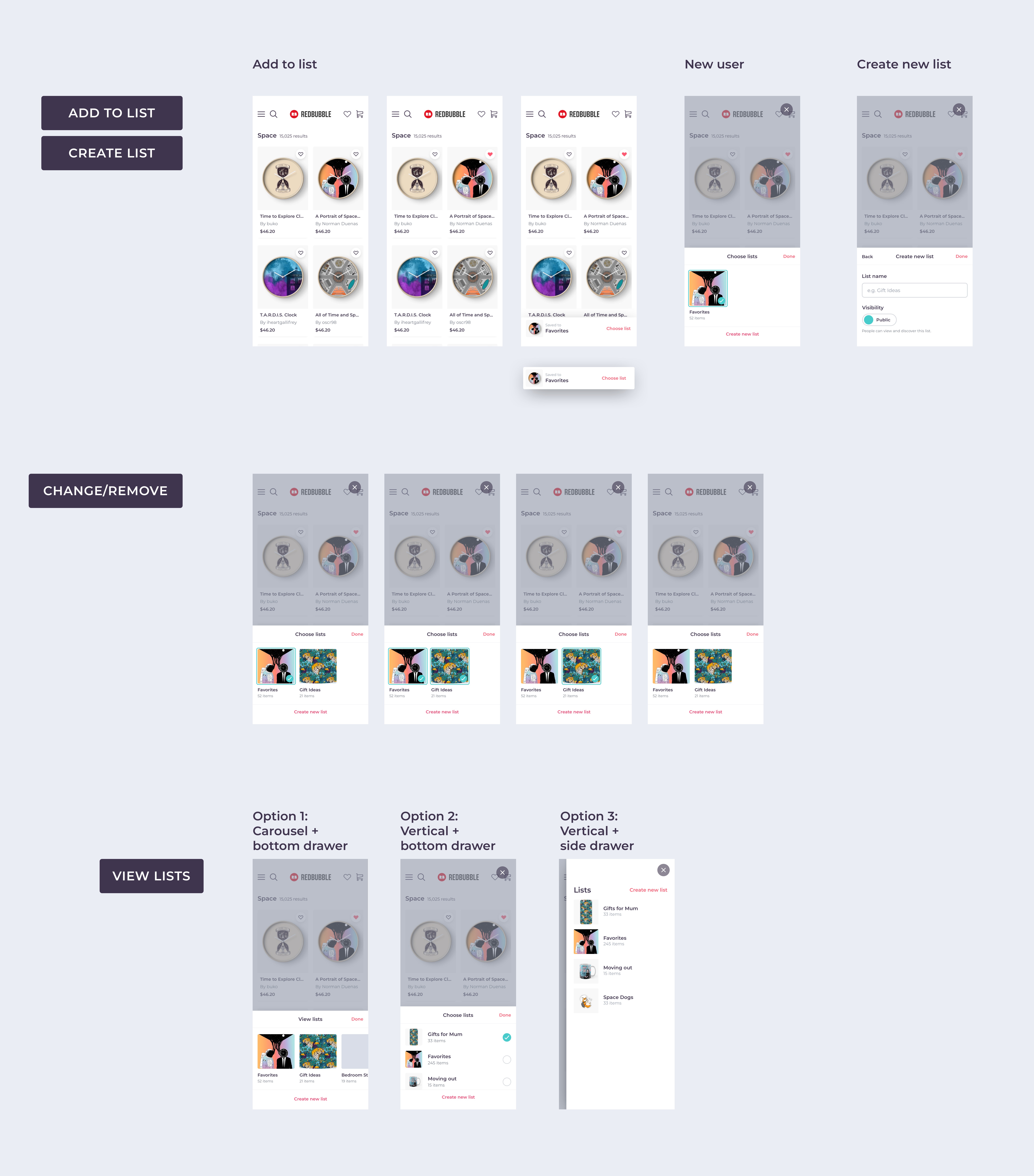
Refined designs for add, remove, create, change and view lists on mobile.
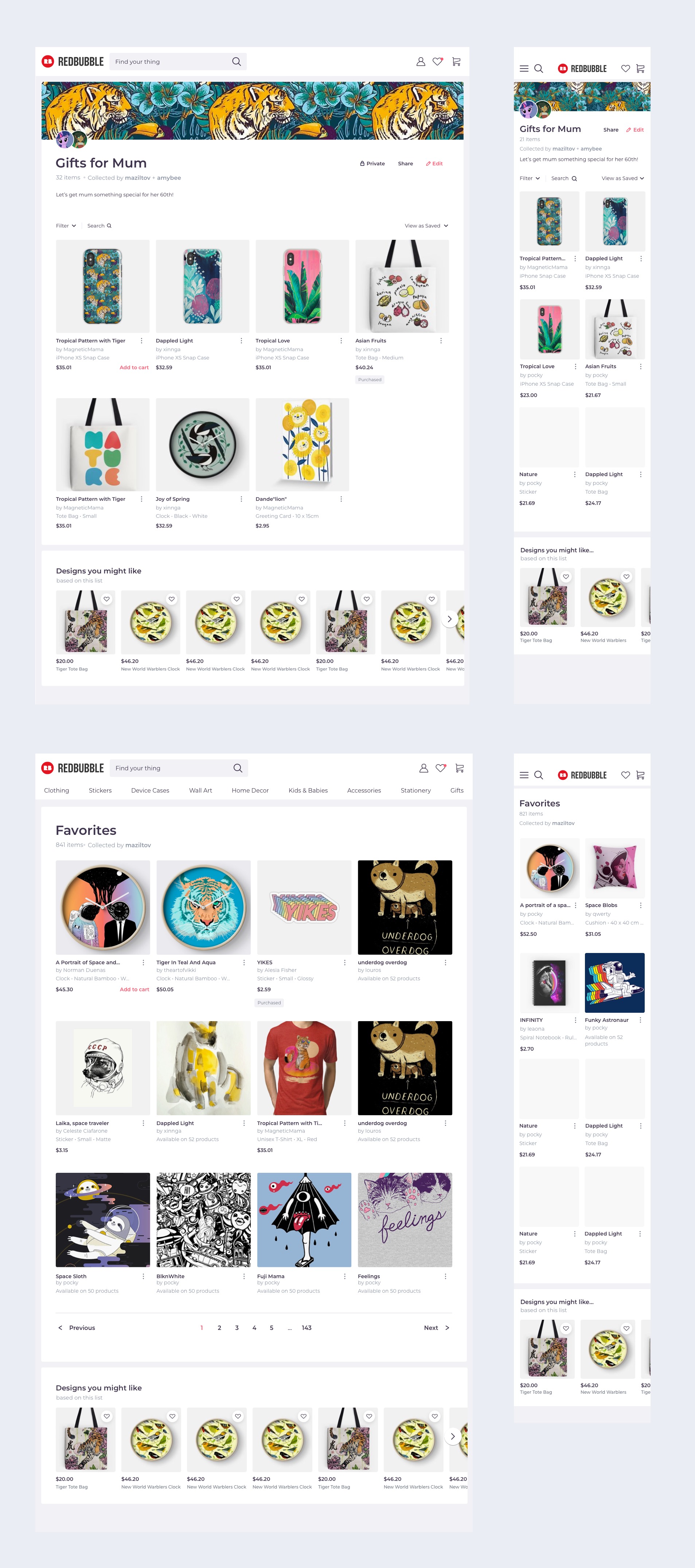
Final concepts for viewing a list, and a favourites-only MVP
Lists, IRL
Thanks for reading! Perhaps you might like to see my other work or get in touch?
