Setting up new sellers for success
Company: Redbubble
Research, Discovery, UX & UI Design
Please excuse the shortness, this case study is work in progress. I'll briefly run you through the context and outcomes, and then share some collateral. If this is interesting, do get in touch!
New artists joining Redbubble had a poor first-time experience and struggled to establish themselves in the marketplace. Through hypothesis-driven discovery we iterated towards an experience that gave new artists a clear path to success.
Redbubble’s marketplace had become increasingly crowded and this made it hard for customers to “find their thing” and for new artists to break in and make their first sales.
We set out to tackle this with a two-prong strategy: my team would help new artists get set up, while another artist-focused team would build a process to review and categorise new artists (using the information the new artists had set up).
The goal we set was to increase the 7-day artist activation rate by 100%, with activation defined as: shop setup complete, 5 artworks uploaded, and some profile information complete.
For this work, I was the product designer embedded in a cross-functional team with a product manager and 5 engineers, with research support on hand.
Design & Iteration
We kicked off this work with a design sprint. This was great for alignment in the problem space. We then conducted fortnightly user interviews to get rapid and timely feedback on our ideas.
With this feedback, I designed guided steps for new artists to complete their shop setup, and collaborated on how to deliver this in iterative steps.
I also reviewed the first-time flow and mapped out ways for us to tighten the initial landing and then the workflows to complete the steps.
The end result was a streamlined experience for new artists that far exceeded our original goal. From this result we felt it was just the start of opportunities to improve the experience for new artists.
Outcomes
- Increased 7-day artist activation rate by 750%
- Decreased time to activation (days) by 120%
Design sprint
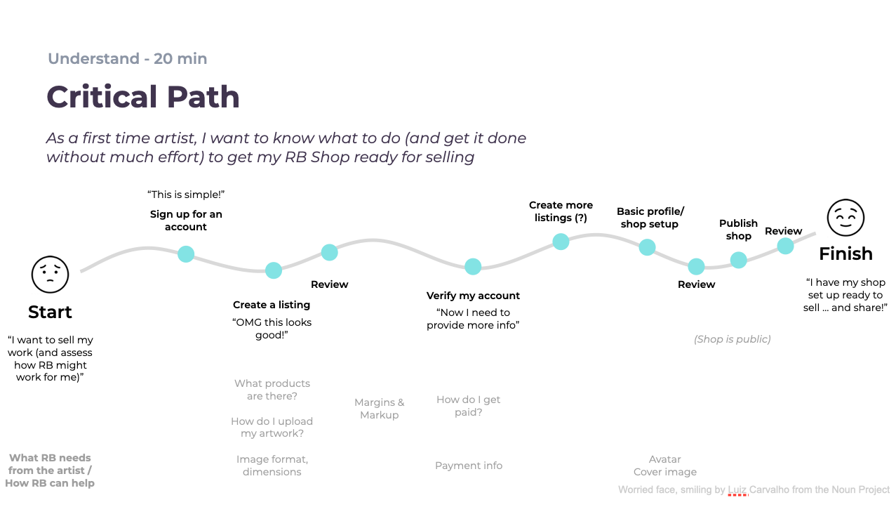
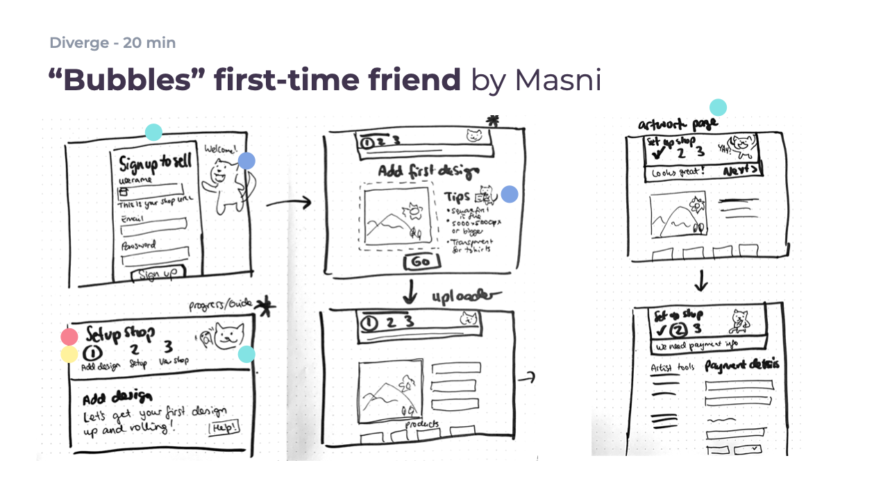
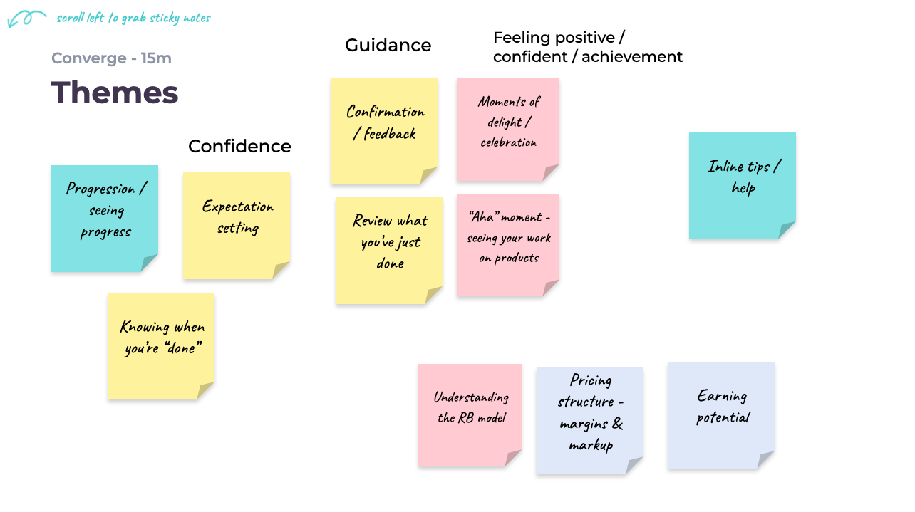
Understanding, diverging and converging in 5 days
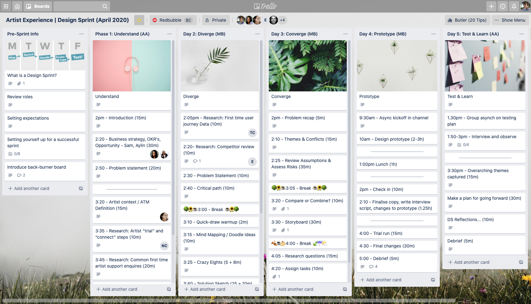
We ran Redbubble's first all-remote design sprint with a combination of Trello and Google Slides as collaboration tools.
Testing & Learning
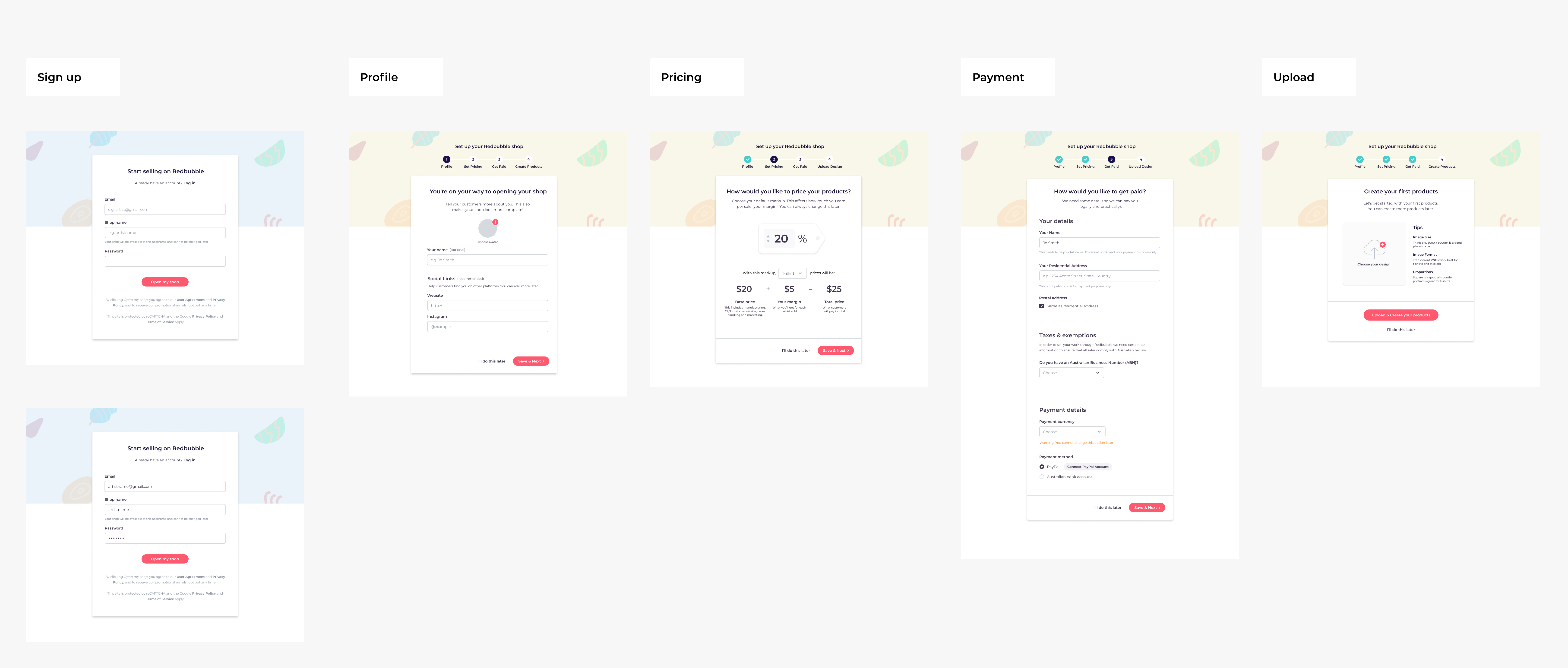
Hypothesis: Onboarding Wizard Steps
The first hypothesis we tested was whether artists would like a guided sequence of steps when joining. We created a click-through concept for interviews.
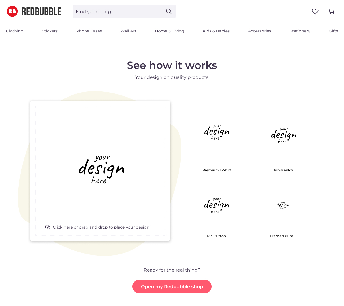
Hypothesis: Trial before signup
We also tested a concept where artists could upload and preview before signup.
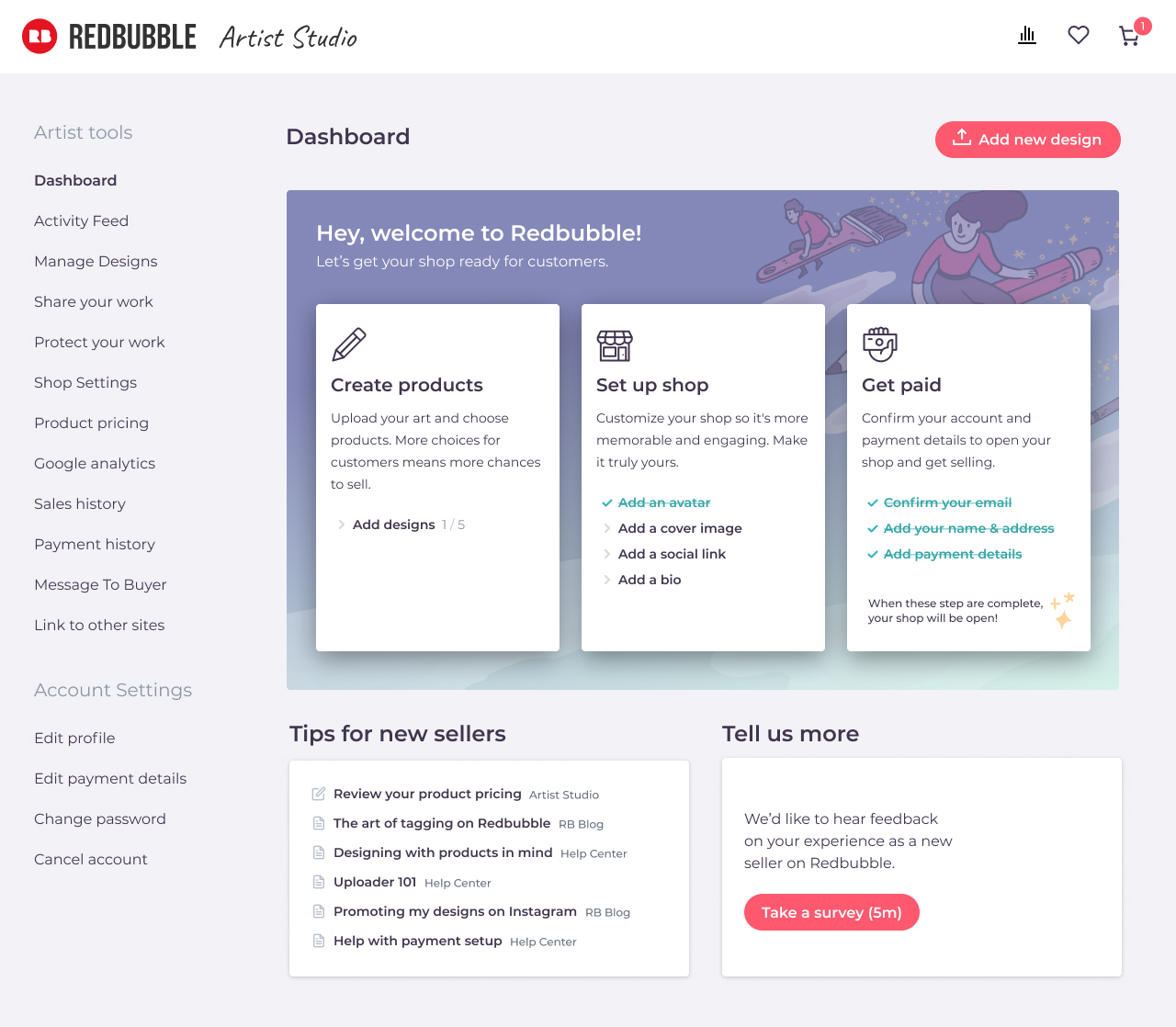
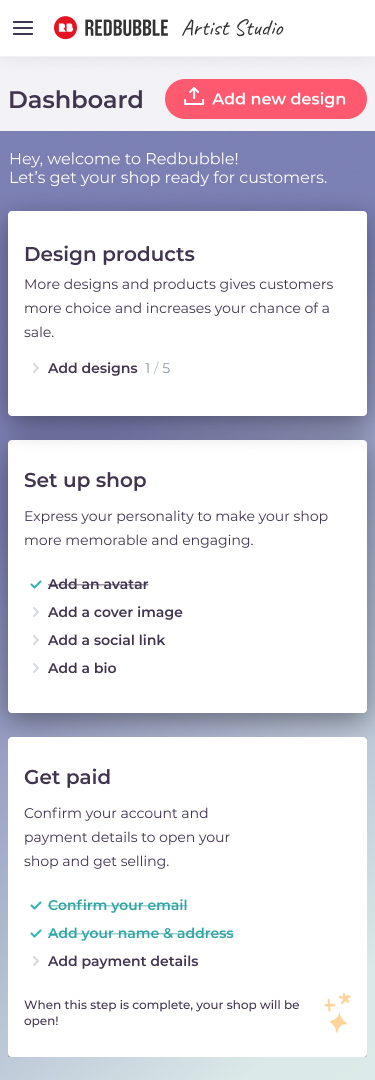
Final Design: Onboarding Steps
We tested and iterated on displaying a series of onboarding steps for new artists to complete. This required a change in first-time landing page and a careful review of navigation to and from these steps.
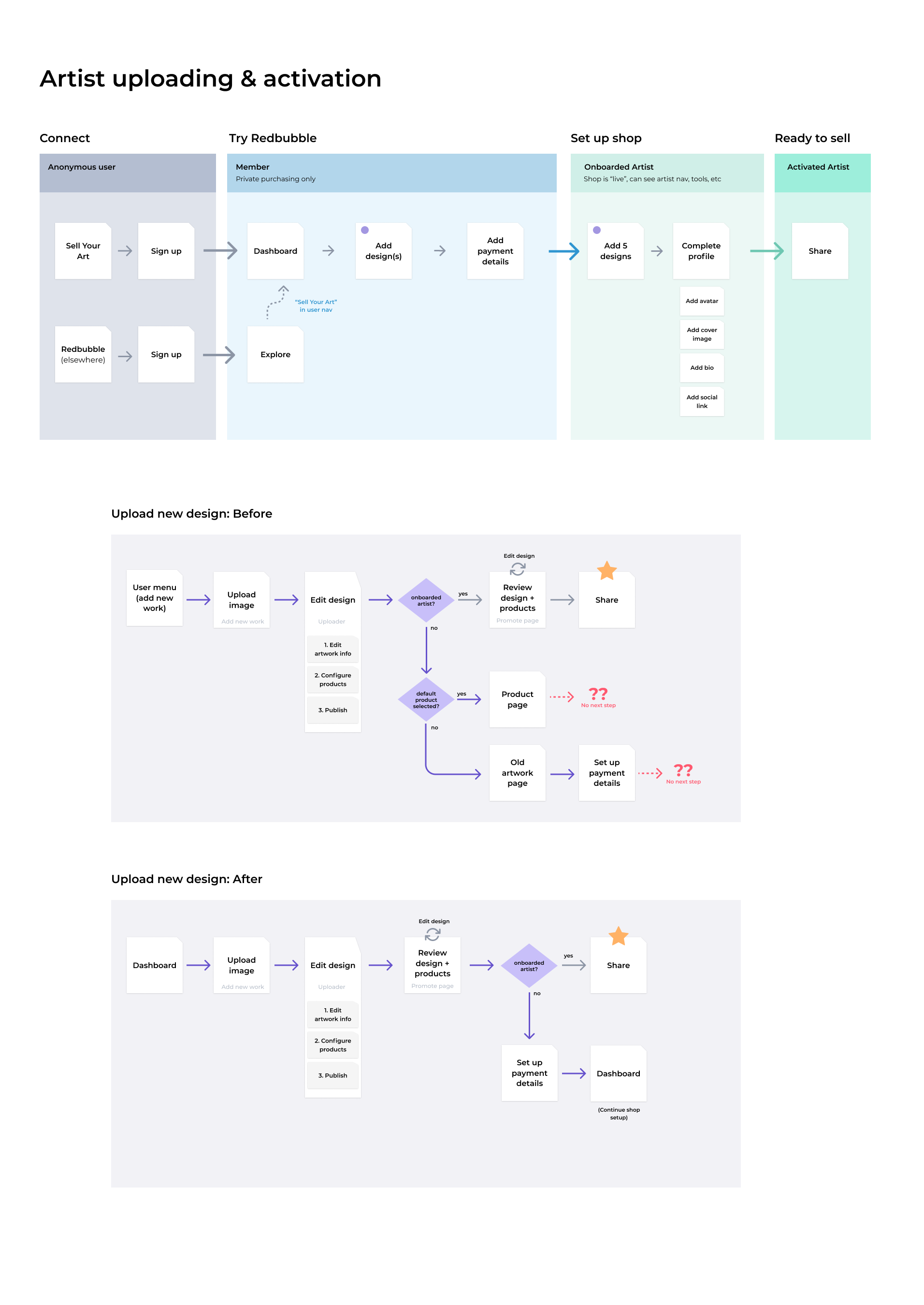
Appendix: Mapping the Flow
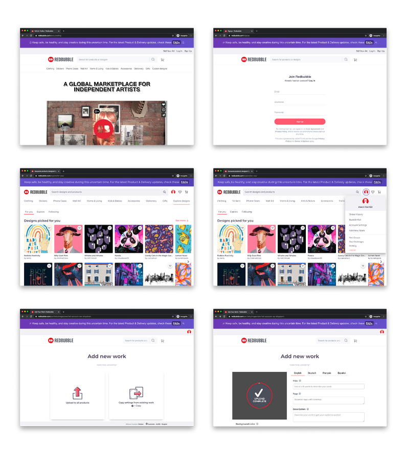
We also reviewed the first-time signup experience and then the workflows to complete the activation steps, to make sure it was as streamlined as possible.
Thanks for reading! Perhaps you might like to see my other work or get in touch?