Photo by chuttersnap on Unsplash
Showcasing artists and their work
Company: Redbubble
Collaboration, Strategy, UX & UI Design
Please excuse the shortness, this case study is work in progress. I'll briefly run you through the context and outcomes, and then share some collateral. If this is interesting, do get in touch!
Artist Shops are the heart and home for an artist on Redbubble, and the shopping pathway for customers who are interested in a particular artist. The experience was languishing on the legacy platform. How might we create a modern shopping experience in 6 weeks?
In 2019 Redbubble’s strategic goal was profitable growth through customer acquisition and conversion. Recent improvements had been made to customer search and landing pages, however other parts of the Redbubble marketplace and shopping experience remained untouched for years.
The artist shop experience was seen as an opportunity to increase customer acquisition and conversion, and aligned with broader initiatives around modernising Redbubble’s end-to-end experience.
This project was a collaboration between artist and customer teams, with 1.5 designers, ~1 product manager, and ~10 engineers.
I was the full-time designer on the project and saw it from design through delivery, launching just in time for Christmas.
Outcomes
- Successful launch of the artist shop for most artists before Christmas
- Increased customer conversion rate to match site average (+1.2%)
- Increased artist-driven traffic by ~30%
- Extremely low (<1%) artist opt-out rate
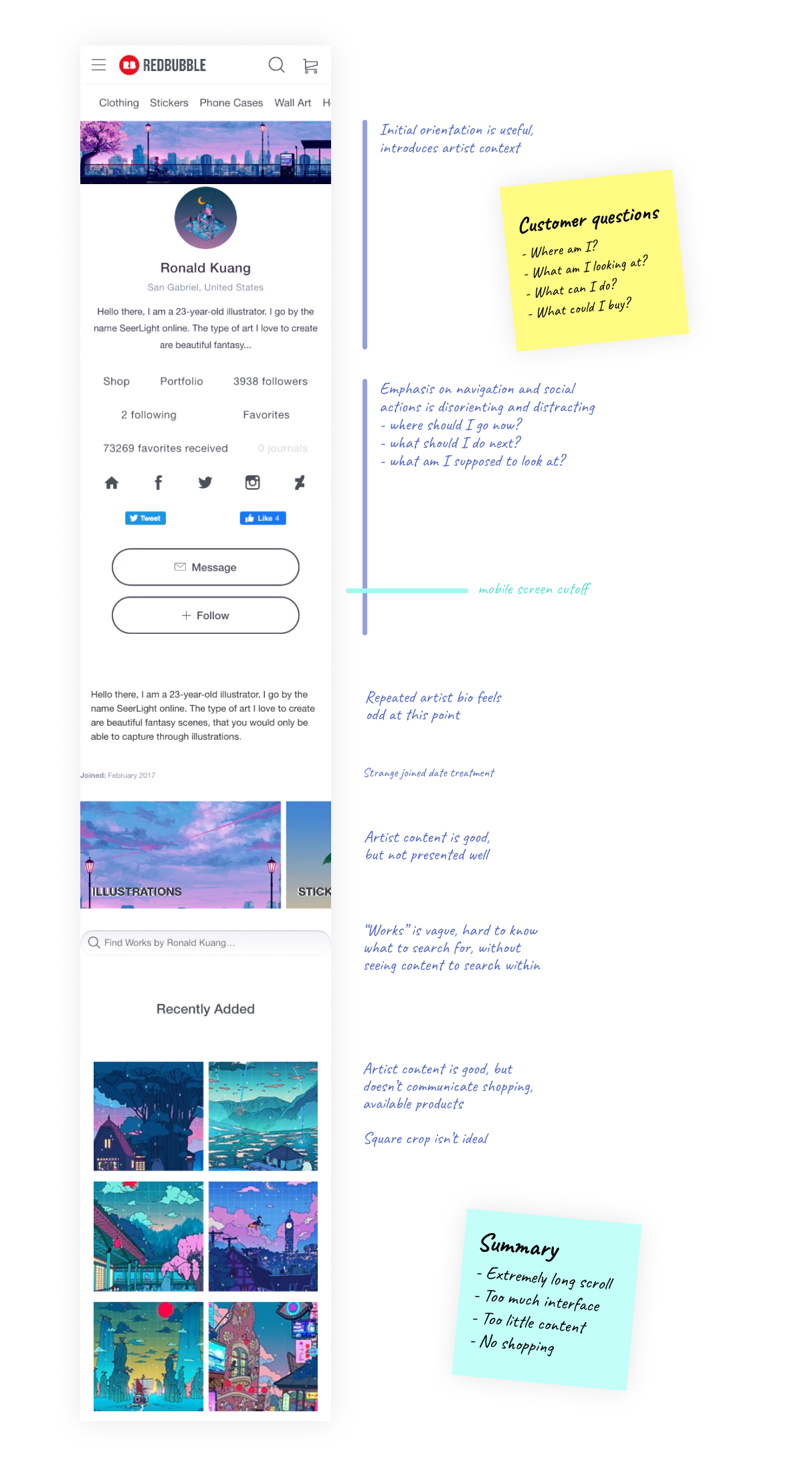
Before
Snapshot of the previous experience, with design notes.
Design Collaboration
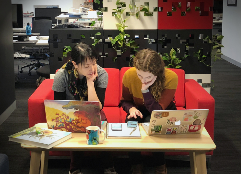
Design pairing
Reviewing the experience with my customer team design buddy
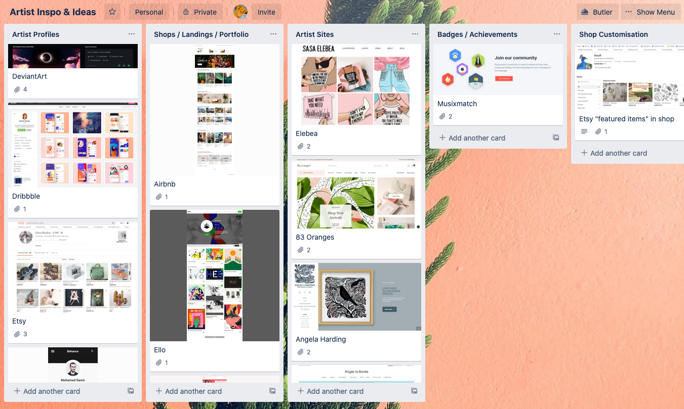
Inspiration
Reviewing competitors, other shops and creative profiles.
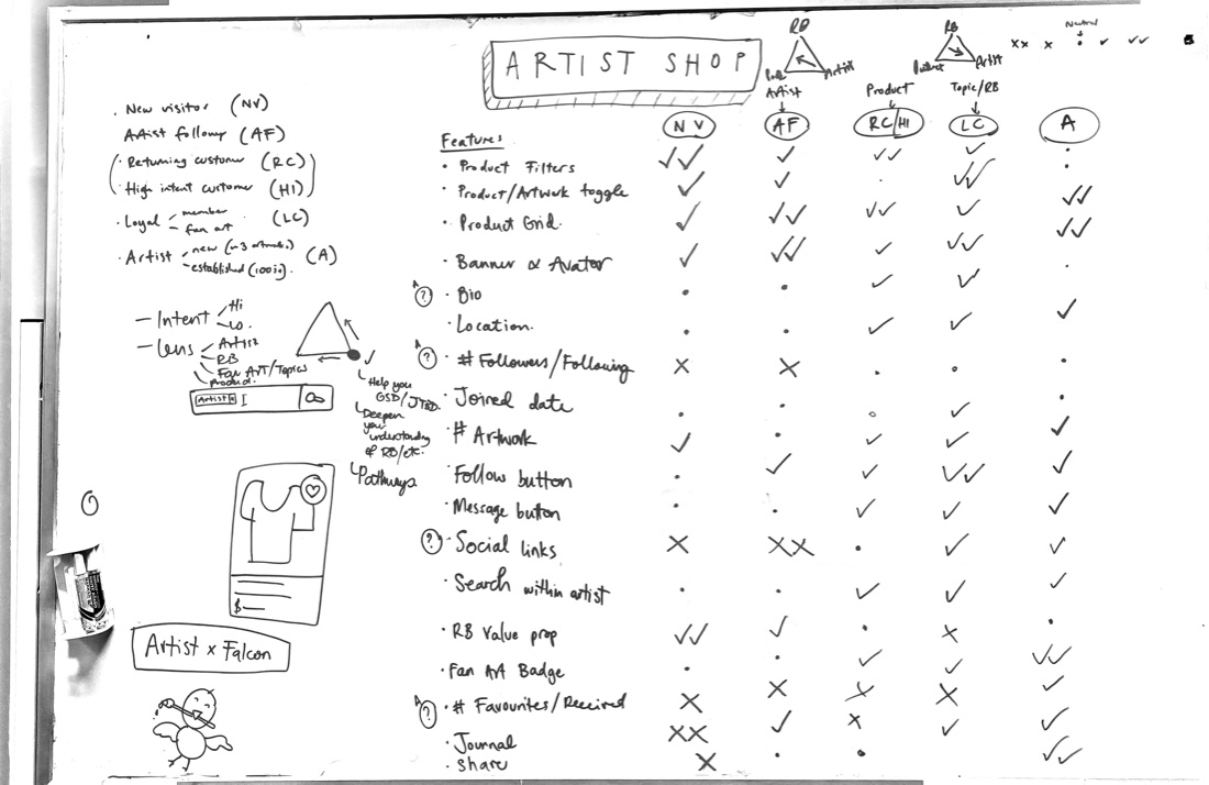
Feature prioritisation for users
Whiteboarding user types, their needs, and how features met those needs
Design documentation
I polished this collaborative working doc into more formal project documentation.
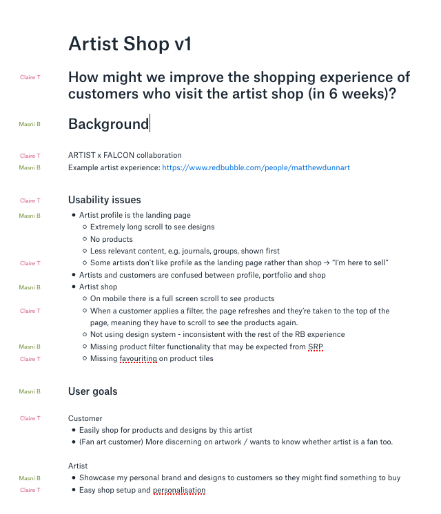
Artist Shop v1
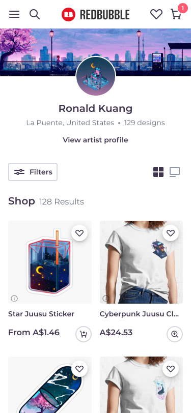
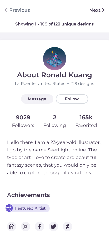
The new Redbubble artist shop that streamlines shopping pathways for customers and elevates the artist and their brand.
We have continued to iterate on the artist shop from this point. Go check out the real thing!
Thanks for reading! Perhaps you might like to see my other work or get in touch?