Research Hub
The University of Tasmania approached Takeflight to build on their existing researcher profiles and to extend the concept to include five new content types: research projects, groups, programs, themes, and research impact.
We took these core requirements and proposed a richly interlinked 'research hub' to allow researchers to fully and present themselves and the extent of their work.
As the lead designer for the project, I had to think about each piece of research content, how each was related, and how to help users confidently explore and interact with this huge volume of content.
Researchers have to carefully curate their reputation to be successful in their field, so it was of critical importance that I understood how researchers would want to present themselves, and create something that reflected well on them professionally.
Finally, I needed to fulfill the university's business goals of communicating the breadth and quality of their research output, and connecting researchers with peers, prospective students, partners and the community.
Research on the research
My first job was to understand how the university's researchers, projects, programs, funding and groups all worked together so I could best reflect that in the designs.
We looked at existing pages, reviewed the information stored in the university's WARP research database system, and asked questions of the research division staff and researchers to build an overview of all the content available and to ensure we understood how everything interlinked and interacted in the real world.
Each different research content type had twenty or more discrete pieces of data associated with it, some of which had subsets of their own – for example, a researcher's publications had its own set of metadata and taxonomies.
In addition, each research content type had relationships with almost every other research content type, and these changed according to different states, e.g. a project wouldn't have an impact until it was complete.
I put together spreadsheets and diagrams to describe the content and entity relationships. This was useful for my design work as well as a key reference for the development team. This helped me see the elements that were consistent across research content types and which were unique.
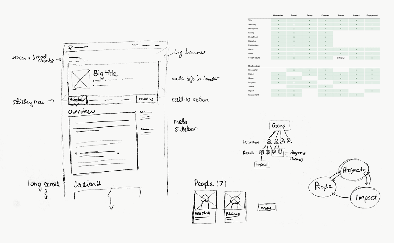
Early 'generic entity' layout sketch, entity relationships, content map.
Enabling discovery and confidence
To help users build confidence as they explored, and to more quickly find the information they were interested in, I wanted each page to have a consistent layout and use common elements.
The designs also needed to make use of elements from the client's established visual design library where possible, and to introduce new elements in an evolutionary and reusable way.
So, using my content spreadsheets as a reference, I reviewed and then laid out the required content for each of the research pages as wireframes. These were “sanity checked” by the client before being developed into full designs.
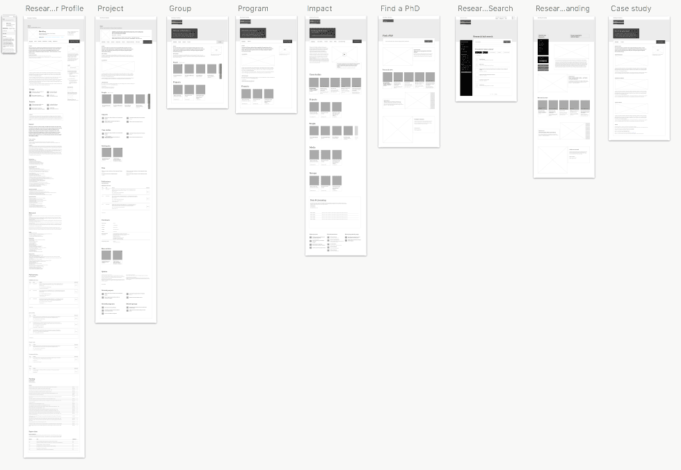
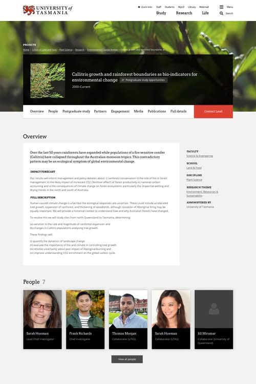
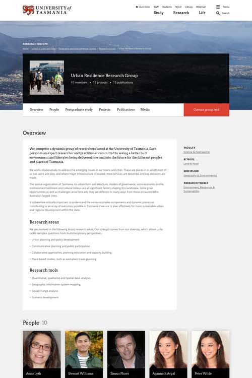
To keep things consistent with the rest of the website, I settled on two header styles that were already in use. I combined them with a new long-scroll page layout that used a fixed navigation and an optional call-to-action button.
The fixed navigation meant that users would always have a reassuring reference point for the content-heavy pages. Although we didn't want users to leave the page, the ability to navigate quickly would encourage and empower users to rapidly explore the site and not get bogged down or feel overwhelmed by details.
This “long-scroll” design pattern has since been rolled out to other parts of the website and has scored highly in third-party benchmarking for user experience and usability.
Researcher (before)

Researcher (after)
A section of the long-scroll page.

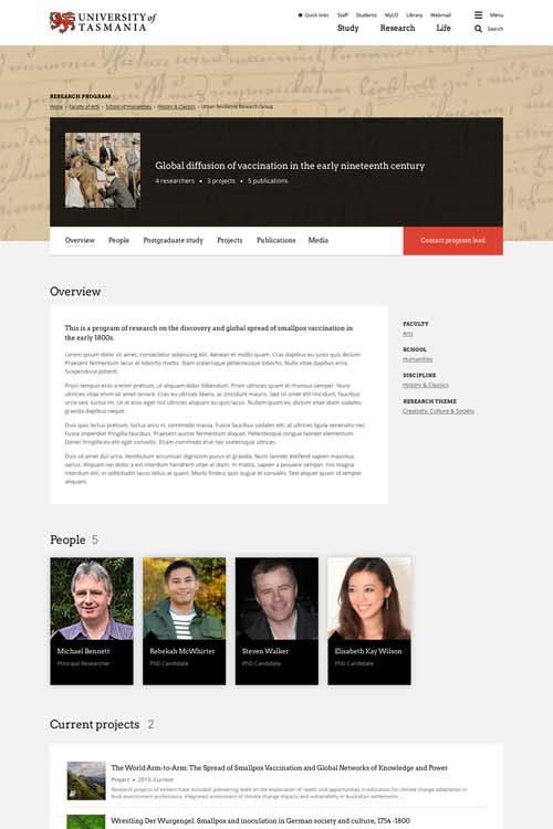
Project
Group
Program
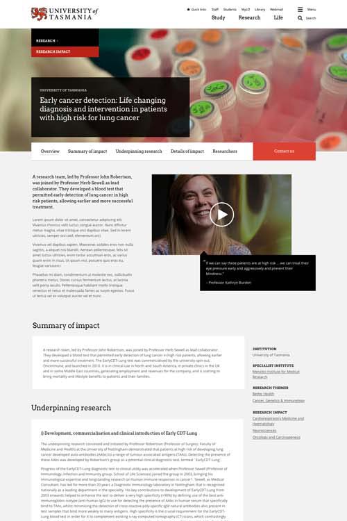
Impact
The final touches
With these long, content-heavy pages, I thought it was important to give users some visual variety and points of interest, as well as to add some special touches so the researchers would feel proud of their profile and the groups or projects they were involved in.
I addressed this through some specially-designed elements such as the researcher's featured publications and awards, and also the "people" blocks in projects, groups and programs.
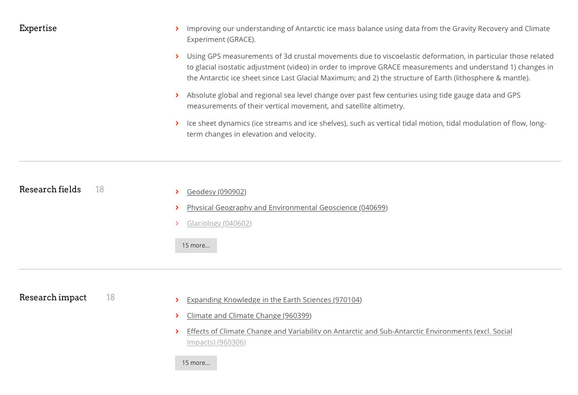
I also introduced two new elements to handle particularly dense content: a new "tabular content" component that utilised easy-to-scan headings on the left, and a "read more" component that trimmed down extensive content.
(I designed and implemented the "read more" component so it would nicely handle many different types of content, e.g. freeform text, bulleted and numbered lists, tables, and image blocks.)
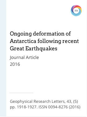
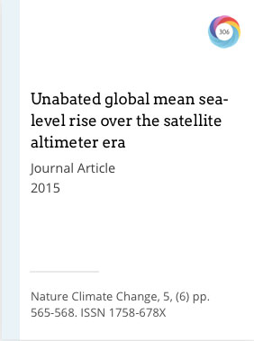
Featured publications
Tabular content + read more elements
Outcomes
The client was very happy with the project, and they're currently in the process of migrating content with an intended go-live in mid-2017.